Behaving like David with a slingshot
4 March 2020

Over the years, the Virgin logo has appeared in many different places. Here, we take a look at its history and how it has changed over time.
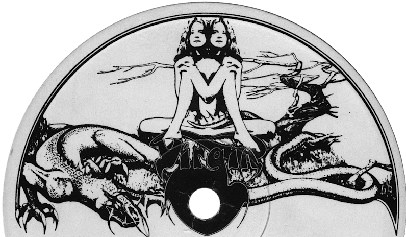
The original Virgin logo was designed by Roger Dean and created with the record label in mind. Often referred to as ‘Gemini’ or ‘the twins’, it was very much of its time. The logo featured Siamese twins sitting by a tree with a long-tailed dragon at their feet. But when Virgin Records signed the Sex Pistols, something new was required. Johnny Rotten was not keen on the idea of a ‘hippy-looking’ logo appearing on the band’s albums.
The challenge, then, was to find a new mark that was fit for purpose. They needed something that was suitable for the Sex Pistols but also wouldn’t feel out of place applied to another, totally different artist.
Cooke Key Associates were briefed with the task and collaborated with a young calligrapher called Ray Kyte, who had previously created the agency’s own handwritten logo.

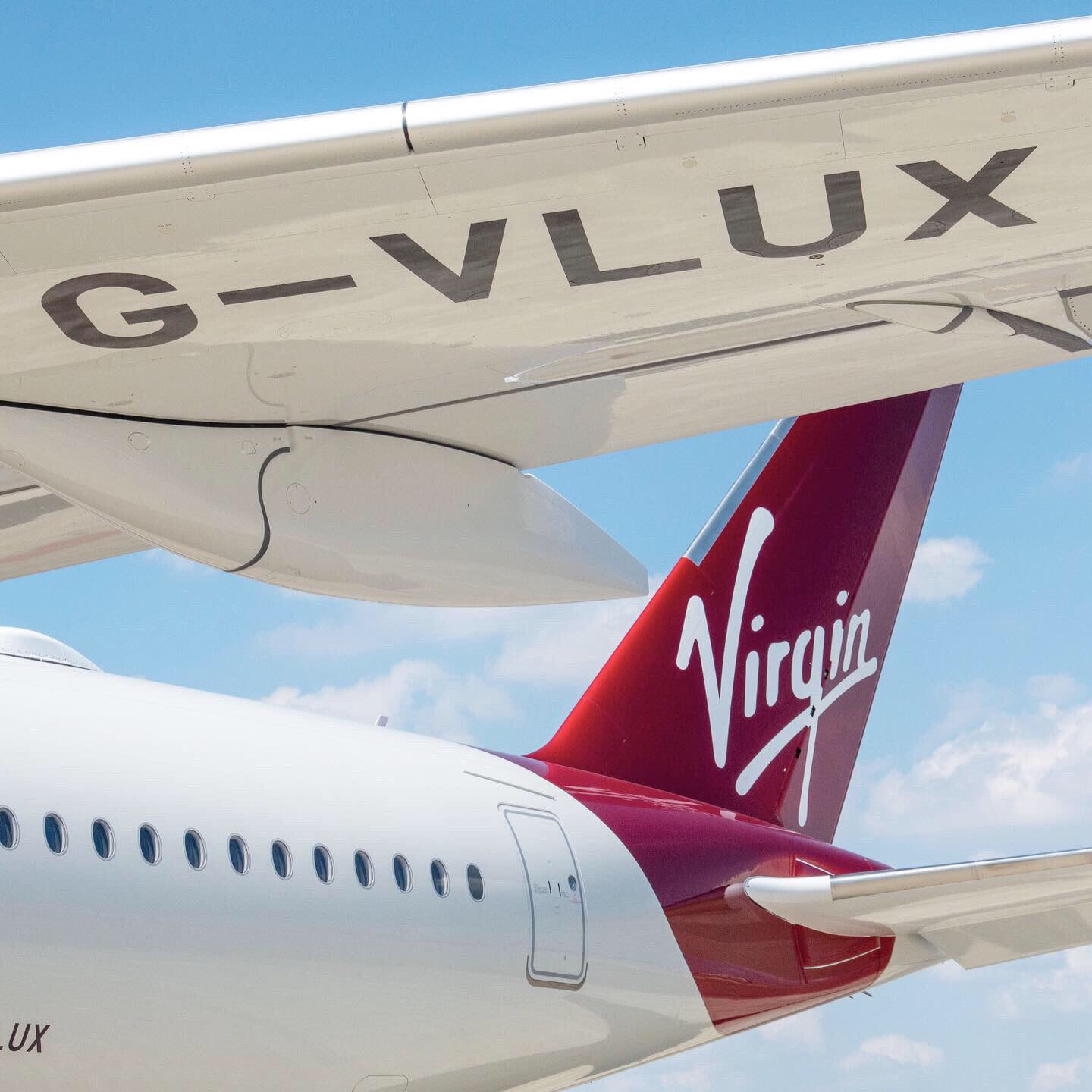
With its tick-shaped ‘V’, the resulting logo known as the Virgin Script, has become synonymous with the Virgin brand and over the years it’s appeared on everything from records to spaceships.
During the 1990s, the Virgin Script was refined into the so-called ‘Blobby’ version due to the need for brand consistency across the ever-growing Virgin Group.

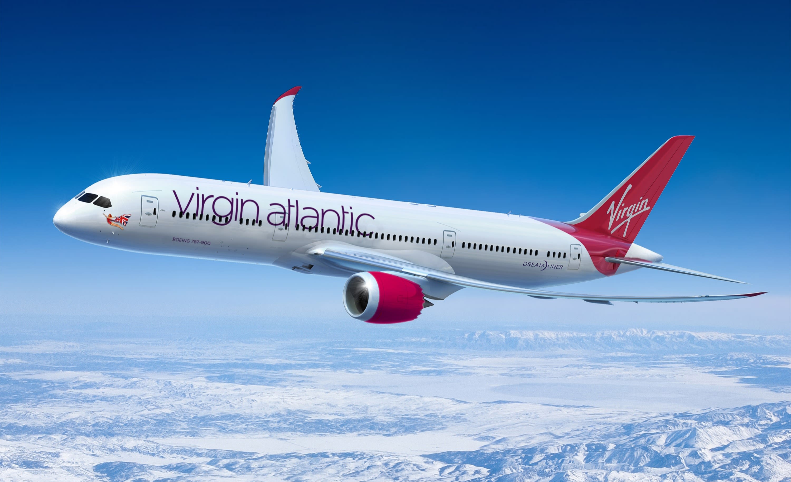
In 2003, the Script needed modernising for the digital world to ensure it was legible across the newly-emerging digital platforms. London-based agency Start was tasked with bringing the Virgin logo into the digital age, while still ensuring the new mark would stand out on large physical signage such as the tail fin of an aircraft.
Start worked with graffiti artists and illustrators to recreate the Script while keeping the integrity of the original work. This version is still used across the Virgin Group today and is integral to the brand’s instant recognition and distinctiveness.