Synthwave is a music genre I’ve been listening a lot to lately. Pulsating basslines, buzzy analog synth leads and evocative saxophone riffs fill the soundscape and transport the listener back in time to the 80s. Well, not exactly the 80s, but something inspired by it.
Enter the aesthetic known as ‘outrun’. Some people call it retrowave.
Cue scenes like a sunset cruise in a Corvette down a coastal highway in Miami; flickering neon lights in a Los Angeles shopping mall arcade; or the glow of signs and screens in the heart of Tokyo. On a smaller scale, imagine palm trees, VHS tapes, and AOL.
But it doesn’t strictly include only things that existed in the 80s — the outrun aesthetic captures the essence of retrofuturism, combining the past with the present and the future. So, what design elements and features make outrun, well, outrun?
The Name
Before we get into the design aspect, let’s talk about the name of the art style. It comes from OutRun, a Sega arcade classic from 1986. Coincidentally enough (or not), the game features the Ferrari Testarossa (yet another automobile favorite in outrun-style artworks) and the starting phase of the game is lined with palm trees by the coast (albeit in daytime). The music is nostalgic and has a distinct 80s vibe, but I digress.
The Color Palette

The outrun art style isn’t strictly limited to neon colors, but it is this distinctive color palette that makes one think of outrun. There is typically more blacks than whites in the palette. Here’s these colors in action on a fan-made infographic for the Ducati 916:
It is believed that these colors come from IBM’s Color Graphics Adapter, developed in 1981. It had a graphics mode that would output higher resolution images, but restrict it to just a 4-color palette. The default palette used key, white, cyan and magenta, the latter 2 being staple hues of the outrun color palette.
The palette might also be strongly inspired by the original Blade Runner film. A predominant use of blues in the movie, coupled with the many neon signs seen on the streets of Los Angeles, appear in many outrun-style graphics.
As mentioned, the palette isn’t limiting, but rather serves as a foundation for the rest of the artwork. For starters, neon tubes come in all hues, and inserting green neon signs in an image doesn’t single-handedly eliminate the feeling of outrun. Likewise, some cars are racing red and sunsets are orange-yellow. Nonetheless, these colors conjure feelings of nostalgia and a longing for the past.
The Cars

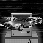
The aesthetic really draws from its namesake on this front. Sports cars from the 70s and the 80s are typically featured in outrun designs, with muscle cars from the same era an equally viable alternative. The DMC DeLorean, the sports car famously known as the time machine in Back to the Future, is a massive favorite of outrun artists due to its futuristic appearance. The photograph above seamlessly blurs the boundaries between outrun and cyberpunk, thanks to some masterful editing by Alex Knight.
Sometimes, the cars aren’t always from a bygone era: modern supercars like Lamborghini Reventons and Nissan GT-Rs make for popular choices. The vehicle in question may even be a concept. For instance, this render of Elon Musk’s Cybertruck by designer Sternberg Union:

This render of the Cybertruck on a grid by designer Sternberg Union features a ton of quintessentially outrun elements, like…
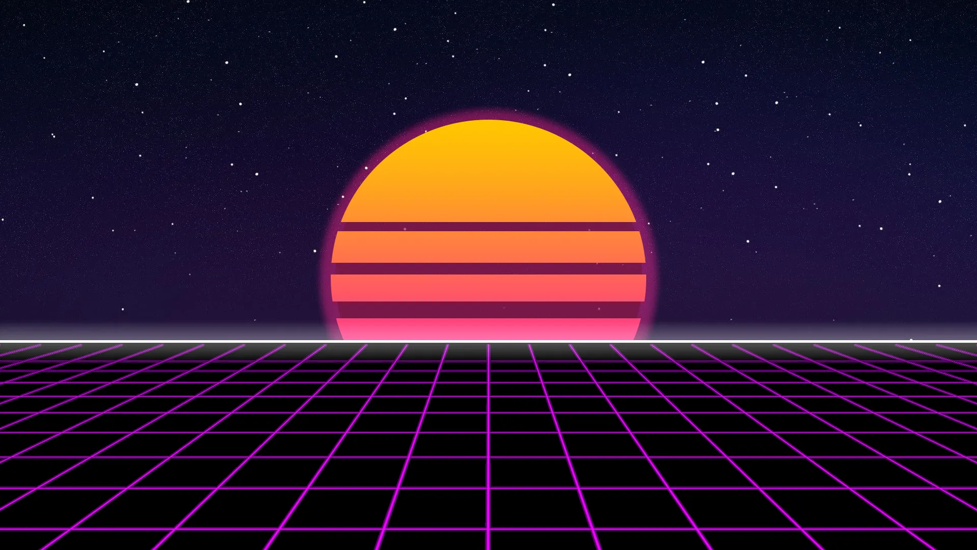
The Sun
The sun used in outrun artwork bears 3 very important (but not always necessary) traits:
1. It’s huge
2. It has lines running through it
3. It has a yellow-to-red color gradient
The outrun sun has its origins in old graphic T-shirts, as a way of depicting the sunset. Here’s a good example of how it looks on a souvenir T-shirt — perfect for waterfront cities like Los Angeles, Miami, Hawaii and Havana.
The sun doesn’t appear in every outrun artwork — you certainly can’t see the sunset while speeding through a tunnel or in the dead of the night. But you can find it in different colors from the yellow-to-red gradient, like the sun in this loop by Reddit user /u/Chinguentes.
All things considered, it’s not a must. But depending on how you use it, the sunset could inspire memories of seeking solace in the peace of the coastal outskirts, away from the hectic pace of city life. Or perhaps, it could even unleash the adrenaline that fuels the thrill of a road chase.
The Grid
Back in 1982, Tron, the Walt Disney blockbuster, began showing in cinemas. It was revolutionary for its use of computer graphics, which was most notably utilized to create the iconic perspective grid. In fact, the grid is essentially the setting for Tron. From then on, the grid saw extensive use in the 80s, in itself becoming a symbol of futurism for that era. It wasn’t restricted to just movies or video games; it found its way to print in some of the strangest and even most tangentially related ways possible, like this UZI brochure from 1984 (yes, the gun).
In most modern outrun artworks, the grid is typically magenta or cyan against a dark blue or a black background, in line with the standard outrun color palette. The grid works in just about any setting that you put it into, be it cars, mountains, skylines or even just the sun.
So if you’re creating an outrun design that doesn’t require a highly specific setting with realistic scenes, a grid would more than suffice and really drive home those 80s vibes.
The Typography

This meme generator should give a pretty good idea of what outrun typography is like. Typically, artists use a brush or script typeface and/or a chrome-plated sans-serif typeface in outrun designs, but as always there isn’t a hard and fast rule about it.
Script and calligraphic typefaces are still seen on neon signs today — one of the strongest inspirations of the outrun style — and it is no surprise that most artists and designers like to add a neon glow to such text. The album cover for synthwave band The Midnight’s Days of Thunder feature a script typeface in cyan with an outer glow, simulating the appearance of a neon sign.
On the other hand, brush typefaces seem to pay homage to a spirit of rebellion. They’re more likely to appear in slightly edgier or technology-centric outrun artworks. This fan-made-turned-official poster for the critically acclaimed 2011 film Drive (another huge influence for outrun designers) uses a bold and reckless brush font that captures the essence of the movie’s main character (a mechanic and stuntman by day, a getaway driver by night).
In contrast to the previous font types, there isn’t any specific typeface that gets the chrome treatment, except that they’re always sans-serif. They’re strongly inspired by the shiny metallic car brand badges from the 50s to the 80s, and many American muscle cars are full of chrome-plated elements on the front grill and the hood as well. Chrome text also seems to take inspiration from the old concept of robots, which used to be imagined as completely metallic humanoid machines. As a result, metallic text has a strong technological or mechanical implication about it.
On their own, script/brush fonts and chrome-plated text stand out and serve well as title and subtitle text for 80s-inspired design. Used together, they are great complementary typefaces that reflect the attitudes that outrun attempts to capture in art, music and the culture in general.
The Rest
The previous elements mentioned are not the be-all and end-all of outrun design. For instance, many outrun artworks feature a neon or metallic triangle in them; some photographs and renders feature palm trees. Some designs don’t even feature elements that are strictly outrun yet still capture the essence of 80s retrofuturism. What I’ve written about so far has been more of what is stereotypically outrun, and outrun is not easy to define — I would argue it is more gut feeling than it is methodical.
It is also worth knowing that some elements of other forms of retrofuturism, such as vaporwave, occasionally overlap into outrun design. The bright, pastel geometric shapes and patterns that are representative of vaporwave may take on a neon hue against a dark background. On the other hand, science fiction and cyberpunk, often inspired by movies like Blade Runner, often bleed into outrun, so armed cyborgs with laser guns from a dystopian future may feature in a car chase scene set in New York in the 80s.
To put it simply, use your creativity, and use your discretion: the immense scope of outrun is there to be explored, and the boundaries of the design style are meant to be pushed.
The Last Word
I’m no authority on outrun/retrowave and absolutely no gatekeeper of the art style or the genre. But as a huge fan of the art and the music of outrun, it’s been fun putting together an article that best represents my understanding of it.
The best resource to know more about outrun (and the music genre of synthwave as well) is the outrun subreddit, as users often post their photographs and designs there. I find it hard not to get lost in the treasure trove of creations there, and some of them are really beautiful.
Now it’s your turn. Jump down the rabbit hole and discover what the outrun art community has to give… or maybe even be a designer and create an artwork that transports viewers back to a future once dreamed in the 80s.
I’ll see you on the other side.